“There are three kinds of lies: lies, damned lies, and statistics.” – Mark Twain
So, I was browsing the business articles when I came across an article (Bloomberg) that states, “Your pay is likely going down next year.” Oh? Well, you’ve caught my attention. Is my company going to ask for money back? Will they give me a new salary offer letter at a lower price? Is this related to tax cuts and tariffs and complex math to show how much my purchasing power decreases although the headline clearly states “my pay” leading me to believe the paycheck I receive will literally be for less money? I must know! In the article it says, “In 2017, companies allocated 15.7% of their total budgets to salary and bonuses. That number dropped to 15.5% this year, and employers are planning on budgeting just 15.2% on pay next year.” The article goes on to tell the reader that companies are yanking money from the budgeted money for bonuses and reallocating that to budgeted salaries to attract top talent. Which should not affect anyone that already has a salary and bonus percentage agreed to. I don’t want to dissect the meat of this article, but rather focus on the very vague statistics of it. Clearly from the comments most people only read the headline and decided they were angry (shakes fist in the air). Thanks Trump! Thanks Obama! A few people actually read the headline, but no one questioned the veracity of these statistics. That’s what troubled me. I work with numbers on a daily basis. I’ve had jobs that were very statistically based leading me to use pareto charts, multiple variable linear regressions, standard deviations, etc. I know firsthand how unbelievably valuable good data is, but how easy it is to twist and sell any story you want if the person on the other end doesn’t think too much about it. For instance, in this article, what do these numbers 15.7%, 15.5%, and 15.2% represent? Is that total payroll expense as a % of revenue, % of operating expenses, or some other denominator? They surveyed 1,026 employers. What size were these employers? Could one really large employer skew the mean (more on this later) so much that the other 1,025 employers look like they are collectively paying less money? Were they located in the same industry? Same city? These are the questions I want answers to when I look at data and it worries me when I see groups of people going both ways in the comments section without one person wondering where these statistics are coming from. In all honesty, I tweeted and messaged the author of the article to point me to the data and they did not respond so I can’t answer any of my questions above.
I am seeing society just take things for face value and refuse to question those feeding us the information, even if we like the results of the data, we should turn a skeptical eye towards it and put on our analytical hats. In this post, I really just want to get you thinking a little more in depth about why critically thinking about the statistics you see can help you make better decisions and judgement. As data has now moved into the most coveted of resources the ability to analyze that data will be extremely important for future success. Anyone who enjoys economics or has read a book like Freakonomics knows how important it is to really dissect every number you see.
Living in Arizona, the news has been filled recently about teachers fighting for a better wage. This has led to a lot of statistics flying around. For instance, one article states the mean (average) teacher pay in Arizona is $53,560. Another article states the median teacher pay is $46,949. That is a pretty big difference. Not only is one number 14% higher than the other, but there is a psychological effect when you, the reader (potential voter), see a number over $50K vs under $50K. It’s the same psychological effect as a retailer selling more “widgets” because they were priced at $99.99 as opposed to a flat $100. Well, should I look at mean or median? It’s up to you, they are both correct statistics, but you need to understand the differences to make a decision based off one or the other. I am currently reading Naked Statistics by Charles Wheelan (highly recommend ALL of his books on Statistics, Economics, and Finance) and he gives a perfect example of the difference, “imagine that 10 guys are sitting on bar stool in a middle-class drinking establishment in Seattle; each of these guys earns $35K per year, which makes the mean and median income for the group $35K. Bill Gates walks into the bar. Let’s pretend Bill Gate’s annual income is $1B (not the actual $11.5B it really is). When Bill sits on the 11th stool, the mean (average) annual income for the group at the bar rises to $91M!” Which of these do you think is a better descriptor of the story? Were you in an exclusive bar full of millionaires or a bar down the street with some regular Joes that Bill Gates just happened to walk into skewing the average? Outliers can skew the average. Median numbers are taking all of the numbers and laying them in a line in order and taking the middle number. If you have a group of people, you would want to use a median number to understand what represents the typical income as that means half of all people are below that and half are above that, but this number will NOT be skewed by extreme outliers like Bill Gates that change the story completely.

Staying with this Red for Ed topic, the pro teachers group had a bill put on the ballot (that would be up for a vote in November) on some taxes that would increase for very high earners (the wealthy). A group staunchly against this measure got it removed by arguing that the language “creates a significant danger of confusion or unfairness.” On one hand, the group that got it removed wasn’t technically wrong, but it was a piece of shit thing to do. The signatures were had and the people should have had their chance to vote, but because of confusion regarding the words describing the statistics, it was basically killed due to “technicalities.” The issue here was that the bill would have said individual earners of >$250K per year, or couples of >$500K per year, would have their 4.54% tax rate increased to 8%. The problem here was the wording. The wording on the bill would have raised the tax rate on high earners by 3.46 percentage points. However, points being the key word here, was never actually stated, but you could infer that just by looking at the numbers 8% and 4.54%. A percentage point, by the way, is a unit of 1%. In this case, the bill would have risen by (8%-4.54%) 3.46% points. When you think about something going up 3.46% percentage (points) it doesn’t really seem that bad does it? Now, if the bill would have said it is increasing taxes on the wealthy by 76% ((8%-4.54%)/4.54%) that paints an entirely different picture in your head. Even if you absolutely hate rich people, that seems like an extreme increase. What’s weird about this, is that both 3.46% points and a 76% increase are absolutely correct descriptions of what was happening. Do you see how easily things can be twisted to fit a narrative?
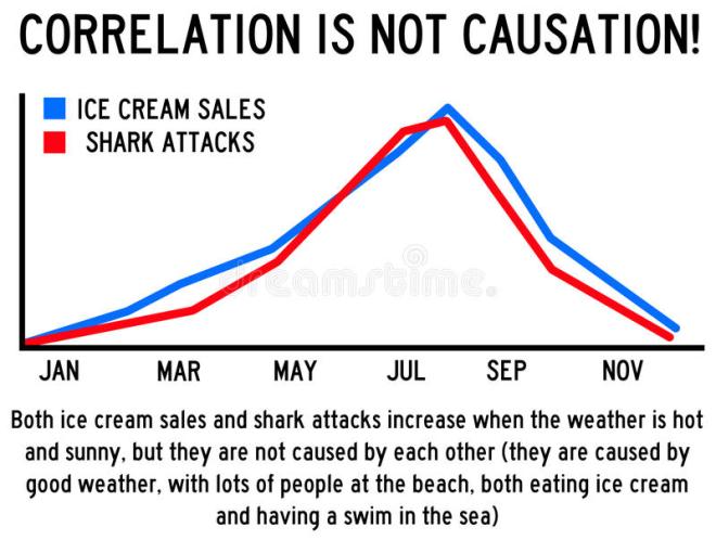
Statistics get infinitely more confusing when people try and “read between the lines” and link cause and effect. You’ll often hear that correlation doesn’t equal causation, but what does that mean? This is where statistics can veer away from science and become more of an art. Did you know that the more ice cream you buy the more people get attacked by sharks? Well obviously they don’t really have an effect on each other. For instance, Shark attacks happen more frequently in the summer, when it’s hot, and people are swimming, and waters are warm for sharks and people to swim in. Coincidentally, when it’s hot, people like to cool down with some ice cream. It just so happens that if you graphed these two INDEPENDENT variables, you would see a perfect correlation, but that does not mean one is the cause of the other.
Some graphs don’t even try and hide how bad they are. Here is one that someone posted while trying to make a point in a Twitter spat I just happened to come across. Which person was right and wrong is not important, but the second I saw this it blew my fucking mind! Without context of the argument, do you immediately see how bad this chart is?
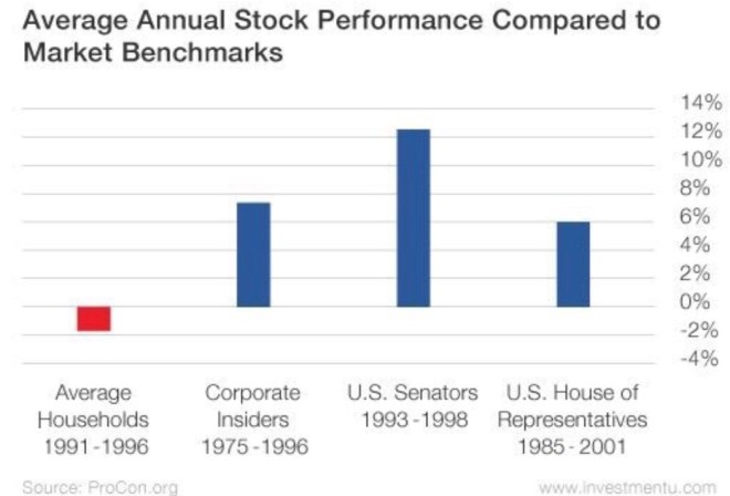
There has to be some comparability variable. In this chart you have 4 independent groups. No problem with that, but you would have to compare all 4 of them over the exact same time period, OR, the groups (population samples) would have to be the same, but over 4 different time periods to see how one group changed over different times. You absolutely CANNOT compare 4 DIFFERENT groups over 4 DIFFERENT (random, not even the same length of years) time periods and gain ANYTHING other than confusion from this. However, the person that posted this needed to prove a point, and to quote Morgan Housel, who recently had some excellent tweets about statistics, “The reason people abuse statistics isn’t because they can’t calculate standard deviations; it’s because stories that confirm your beliefs are more persuasive than stats and always will be.” Now, I don’t know Morgan at all, but would assume he runs in a different intellectual group than the average American by assuming most people can calculate standard deviations, or even know what a standard deviation is, but the quote is still spot on when it comes to proving out what you already believe. There takes a certain amount of self-awareness to have the ability to go in to something with an opinion and be perfectly ok, albeit shocked, when you are proven wrong by dissecting hard data. If you keep cutting numbers to try and prove your point, then you are a part of the problem.

Lately plastic straws have been painted the pollution bad guy. Social media has been in a rage about how harmful they are, and big business is very eager to announce they will comply and help (Disney, Starbucks, and restaurants all over announced bans). However, the statistics are telling. Many articles, AFTER the social media tidal wave had already done its job, reported on how meaningless plastic straws actually are in the grander pollution fight. One Vox (purposefully picked as no one could claim they aren’t liberally biased) article stated, “on a global scale, straws would probably only account for 0.03% of total plastic waste by mass (Vox).” I’m not going to argue with you if you want them banned, and I am very aware that decreasing pollution by even 0.03% is better than nothing, but I wonder if the articles were titled, “Hooray, plastic straws are banned, but the other 99.97% of pollution is still killing us!” people would be so proud of themselves today. The point again is to do your research and think critically. Statistics can be manipulated, artfully represented, or just flat out omitted if it means that person/group achieves their goals. Businesses, by the way, ate the straw thing up because they have a huge expense savings now on plastic straws, which they gave to us for free (not revenue generating), do not have to decrease their prices, a result of said cost savings (pure profit increases), and get all the positive PR from making this very tough choice.
Side note; Fox News are PROs at manipulating statistics, just look at this chart. Notice how the 8.6% in November is higher than Jan through Mar, and even with April, even though the number is the lowest one on the graph? Also, the 9% in Oct and 9.1% in September are on two different bars although the key the left makes it look like each bar is about 5%.

On this one, the numbers add up to (59% + 35% + 26%) 120%. The irony being that they are calling out scientists for supposedly “falsifying data,” when the data used to prove that can’t possibly be correct.

Just remember, as midterm elections approach, quarterly earning calls come up, and the next wave of public outrage finds your social media wall, don’t be afraid to question it all.